


When it comes to content marketing, how you present the content is just as important as what you say. Good design will mean the content is seen, engaged with and understood by a broader audience. It conveys your authority, tone, level of professionalism and more. If it’s just an afterthought, you’re selling your content – and content ROI – short.
We sat down with Dillon Calkins, Design Services Manager at 3 Aspens Media, to discuss the importance of design in B2B content marketing.
Q: What is B2B design?
For me, it is creating a visual language to help convey a message, and to convey that message in the best hierarchy of importance, to a business’s audience, whether a client, partner or employee. This means understanding who the audience is and what the goal of the piece is. Are you trying to educate, inform, convert or get clicks? Design is key to delivering a message. You may have the best message in the world, but if people don’t know how to read it based on visual cues, it can still fall flat.
Good design can transcend cultures and languages. There’s an element to it that’s natural. It signals things that are good, bad, dangerous and important. We see that in our signage and day-to-day lives, whether in nature or the city. There are so many signs that are universal. People know what arrows and stop signs signal without the words. We know that red is usually halting, yellow is yielding, etc.
Bad design can lead people astray. It is as bad as poor communication. It can give the wrong impression, lead somebody on a dangerous or harmful path or, in the case of content, not attract the right audience.
Q: How do you distinguish B2B graphic design versus visual?
Visual is a broader term. It encompasses everything we take in with our eyes. Visuals include graphics but incorporate so much more. It can include everyday objects, photography, film, etc.
Graphic implies there was a plan behind it. Graphic design is more representative of something in the real world, it’s a visual tool. They are representations of our visual world limited to forms like 2-D animation, icons, illustrations, etc. Design helps communicate ideas to a broad audience. There is often room for interpretation but it’s better when it’s universally recognized, i.e., signs, labels, icons.
Q: What is functional design and why is it important?
The idea behind functional design is that everything has a purpose. For instance, if you have little curly cues and icons all over a page, are they doing anything aside from making it look pretty?
In our line of work, we’re not designing things just for the sake of making them look good. We design them so they look good – and the information is delivered in the way we intend it to be. I don’t want anything superfluous or unrelated on the page.
I often throw on more than is needed initially in a mockup, then pull and cut back to get to the important parts.
On the cutting room floor, you might find:
- An unrelated image: I don’t want to use an image that has nothing to do with the article. There must be a visual connection between it and the content it’s next to.
- A suitcase icon: I may love this icon of a suitcase, but if there’s no purpose for it and I’m not using icons anywhere else, why would I use one here?
In the final version, you might find:
- Related icons for takeaways: If there are three main features I want the reader to take away, I can put icons next to them to emphasize them. These serve a purpose as visual summaries.
- Related images, graphics and callouts: Visual cues like pictures, graphics and callouts are simple ways to draw attention to information and break up long content. They also make the highlighted information easier to pull out and share on social, with your team, etc.
Q: What types of content assets do you typically design?
More of our clients are embracing an almost entirely digital experience, so we design:
- Reports (annual, one-off)
- Whitepapers
- Web banners
- Social cards/graphs
- Email graphics
- Blog images
- Infographics
Some assets are interchangeable with print. For example, PDFs are printable, but most people still read them on digital devices. However, the digital version can be interactive with links.
We also create a lot of assets for conferences, such as:
- Banners
- Tradeshow booths
- Flyers
- Brochures
- Magazines
Additionally, there’s a lot of opportunity to create multi-functional and interactive digital assets. You can link to a video, have moving graphics, etc. It’s just a matter of whether there’s a rhyme or reason to do so, instead of just doing it for fun.
Designer Tip: Create consistency from one asset to another. Ask yourself, does the asset you’re linking from match the destination it’s going to? And is it clear what the link will go to? If I’m reading a whitepaper and it links to a graphic on the company’s website, there should be harmony between the whitepaper, website and graphic. It doesn’t have to match, but harmony lets me know I’m not being taken to a completely different brand and the source is trustworthy.
Q: How do content marketing and design relate?
Content marketing is about delivering useful and timely information to an audience. The design must convey that information in an accessible, visually intriguing way.
One of the most basic elements of design is layout. With layout, I make sure everything is balanced and the text is legible, useful, etc. And that’s just addressing the text: font, spacing, size, background. When you see bigger and smaller text in a book or newspaper, that’s a hierarchy system in the layout.
For example, with a blog or whitepaper layout, designers must determine:
- What is the first thing we want the reader to pay attention to? What’s the second? What’s third?
- What’s the best way to organize this so it is comprehensive, flows well and doesn’t cause confusion? You don’t want to lead your reader astray or take them away from your content altogether.
Reading from a Word doc can get exhausting. We put it into a nicer layout and break it up, making it easier on the eyes.
Design also complements and enhances written content. It could be as simple as bolding text or changing its color to bring attention to it or add emphasis. When assessing layout from this perspective, a designer might look for opportunities to pull out attention-grabbing text and use visual elements like pull quotes and color to emphasize points.
For instance, with infographics, designers create visual representations of the written word to make a larger connection and provide a lot of information quickly. The key is to space the information out and present it in a way that isn’t distracting or confusing.
Let’s say you have the text: 27% of people stopped smoking in 2023.
The meaning’s there, but adding something visual can support quicker comprehension. I could put a “No Smoking” sign next to the stat, and the audience will know it’s about not smoking or quitting smoking before they read the words.
We consume stuff so quickly these days. Writers put in so much effort, but is everybody reading every word? Not necessarily. My job is to make sure the most important elements are easily identifiable.
Designer Tip: Don’t overdo it emphasizing text. People tend to overemphasize text. They’ll underline it, put it in bold, italics or color. Ultimately, you only need to do one, maybe two of those things.
Q: How does digital content design affect the user experience?
Digital design affects the user experience in a lot of ways, so it should rely heavily on functional design that serves your audience and client base. B2B UX design involves:
> Buttons, calls to action (CTAs), videos and gifs, options to react with emojis and likes. You want consistent buttons that look like buttons to the user. And you may have a button hierarchy, such as a big red button for the most important action and smaller blue buttons for all others.
> How your website is laid out. Does it have good navigation? Is the hierarchy clear? Is it clean or do you have multiple visual cues calling out for attention and distracting users from the primary content?
> Typefaces for readability. Some are easier to read than others for certain mediums. Especially serif fonts, which have little feet on them. It’s theorized that the feet help your eyes move on to the next letter, providing a path and giving it a flow. Are you using web-friendly fonts? Regardless of serifs or no, some fonts are just not very legible on screens. There are many typeface creators who’ve refreshed older typefaces and created all new ones to be web-friendly.
> Font colors and background colors. A light font is great on a screen – if you like not being able to read it. You may have great vision, but not everybody in your audience does. So, what is the best option for people? 99% of the time, the main font on your website should be black or a very, very dark gray to make sure it’s clear. Save pops of color for CTAs and emphasis.
> Font size and spacing. A 14- to 18-size font may sound too big, but most devices automatically adjust between our phone and big screens. You want to have the right size.
> Content hierarchy. What do your subheads and headers look like? Is everything organized correctly?
Designer Tip: If you’re doing white on a dark background, do it sparingly and make the font large. The play of white on black text is actually a lot more challenging for your eyes to read. Your eye is focused on the brightest thing on the screen, even on the black background, and it can cause eye fatigue.
Q: How can businesses better integrate design into their processes?
Don’t forget that design is part of the process. For companies with in-house designers, bring them into the discussion in the early stages of planning to understand what is necessary to convey the message of a project. Involve them more in the creation process and communicate with them more. The designer may be able to see it in a way the writer may not.
For example, if you’re coming up with a blog, article or presentation and would like design elements, ask your designer if they want to work with you on it. They can help you create visual oomph, highlight the most important parts of your content and convey information visually beyond just text.
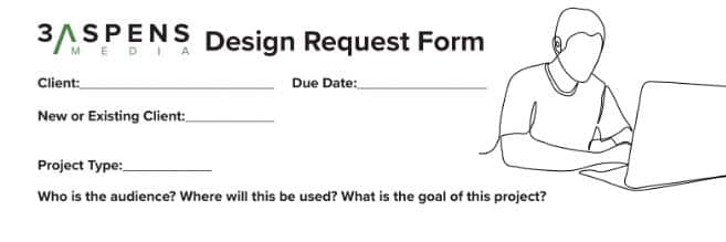
Looking to make your content design process more efficient? Try using this free design request form! Ultimately, you may settle on a form that is more or less detailed depending on your designers’ preferences. But ours can be a great starting point!
If you need support designing content assets for your business, check out our design services and reach out to us at info@3aspensmedia.com.


'%3e%3cg%20id='Final-Copy-2_2_'%20transform='translate(1275.000000,%20200.000000)'%3e%3cpath%20class='st0'%20d='M7.4,12.8h6.8l3.1-11.6H7.4C4.2,1.2,1.6,3.8,1.6,7S4.2,12.8,7.4,12.8z'/%3e%3c/g%3e%3c/g%3e%3c/g%3e%3cg%20id='final---dec.11-2020'%3e%3cg%20id='_x30_208-our-toggle'%20transform='translate(-1275.000000,%20-200.000000)'%3e%3cg%20id='Final-Copy-2'%20transform='translate(1275.000000,%20200.000000)'%3e%3cpath%20class='st1'%20d='M22.6,0H7.4c-3.9,0-7,3.1-7,7s3.1,7,7,7h15.2c3.9,0,7-3.1,7-7S26.4,0,22.6,0z%20M1.6,7c0-3.2,2.6-5.8,5.8-5.8%20h9.9l-3.1,11.6H7.4C4.2,12.8,1.6,10.2,1.6,7z'/%3e%3cpath%20id='x'%20class='st2'%20d='M24.6,4c0.2,0.2,0.2,0.6,0,0.8l0,0L22.5,7l2.2,2.2c0.2,0.2,0.2,0.6,0,0.8c-0.2,0.2-0.6,0.2-0.8,0%20l0,0l-2.2-2.2L19.5,10c-0.2,0.2-0.6,0.2-0.8,0c-0.2-0.2-0.2-0.6,0-0.8l0,0L20.8,7l-2.2-2.2c-0.2-0.2-0.2-0.6,0-0.8%20c0.2-0.2,0.6-0.2,0.8,0l0,0l2.2,2.2L23.8,4C24,3.8,24.4,3.8,24.6,4z'/%3e%3cpath%20id='y'%20class='st3'%20d='M12.7,4.1c0.2,0.2,0.3,0.6,0.1,0.8l0,0L8.6,9.8C8.5,9.9,8.4,10,8.3,10c-0.2,0.1-0.5,0.1-0.7-0.1l0,0%20L5.4,7.7c-0.2-0.2-0.2-0.6,0-0.8c0.2-0.2,0.6-0.2,0.8,0l0,0L8,8.6l3.8-4.5C12,3.9,12.4,3.9,12.7,4.1z'/%3e%3c/g%3e%3c/g%3e%3c/g%3e%3c/g%3e%3c/svg%3e) Your Privacy Choices
Your Privacy Choices